Fred Troller Design

The first comprehensive survey of the work of a pioneering graphic designer who brought Swiss modernism to America in the 1960s, via influential projects for clients such as Geigy, American Airlines and IBM

534backers £54,029.54of £45,000 pledged
FUNDING SUCCESSFUL
120% funded

Overview

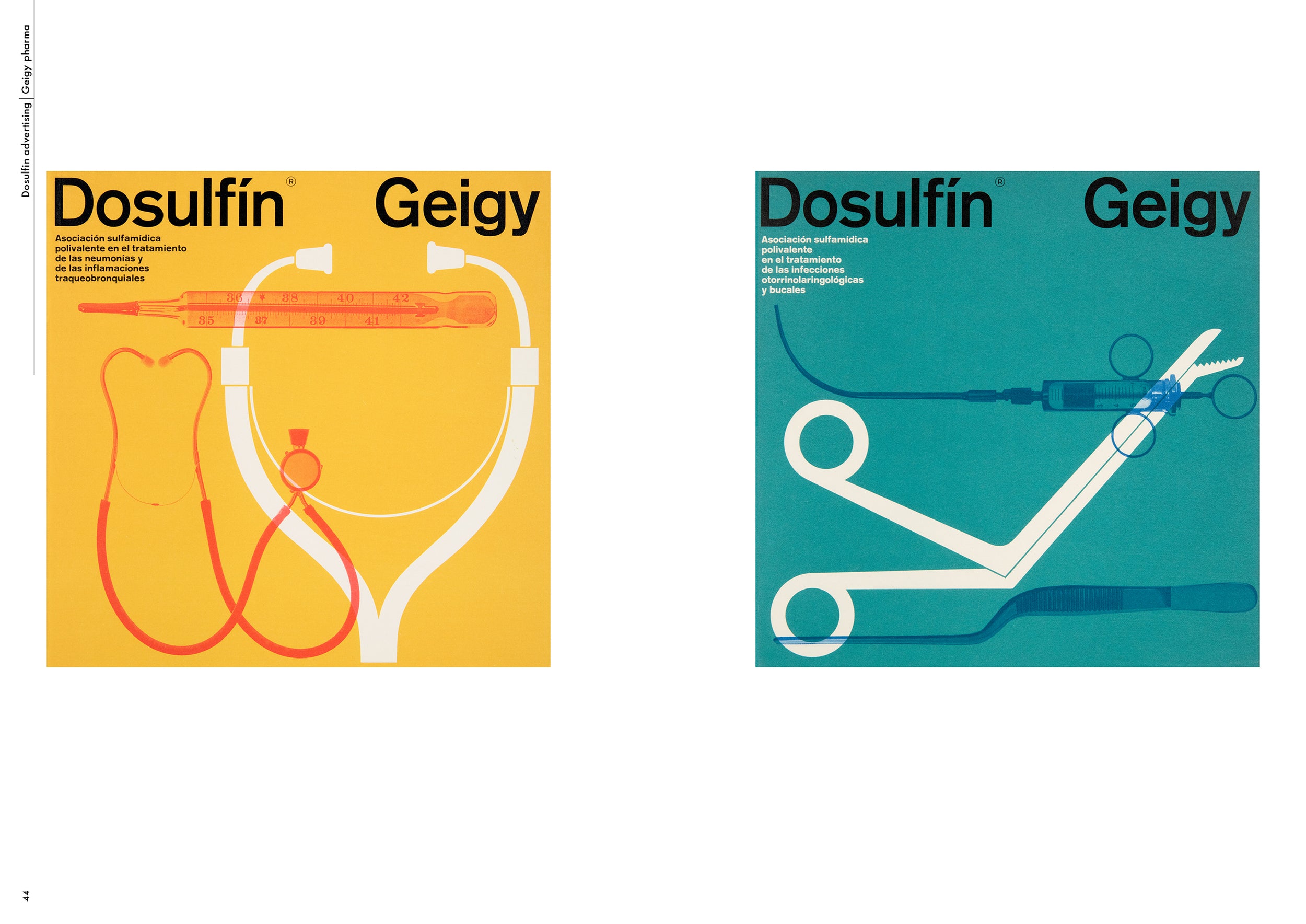
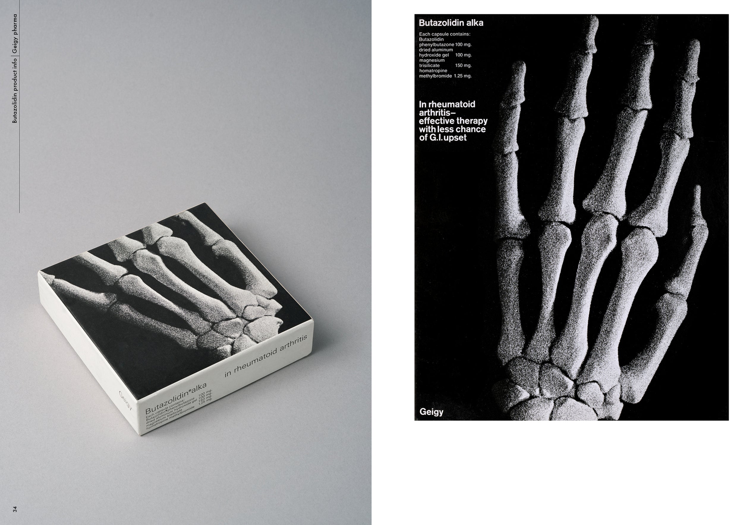
Graphic designer Fred Troller forged a Swiss modernist path through corporate America in a career that spanned five decades and began in the early 1950s. Troller’s dynamic approach made use of bold colour, photographic imagery and minimalist sans-serif typography. His striking, type-led graphics were applied to everything from packaging for the Geigy Chemical Corporation to posters for American Airlines and paperback book covers for publishers Doubleday. Troller was preoccupied with eliminating visual chaos and the desire to communicate complex ideas with concise minimalism – ideas that contrasted to the more ornate trends that prevailed in US visual culture in the 1960s.

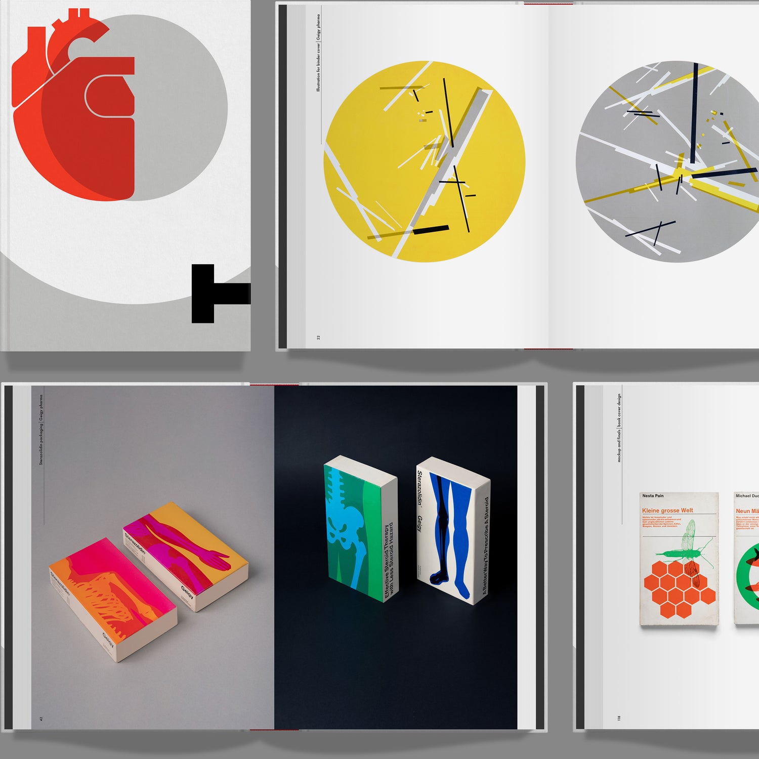
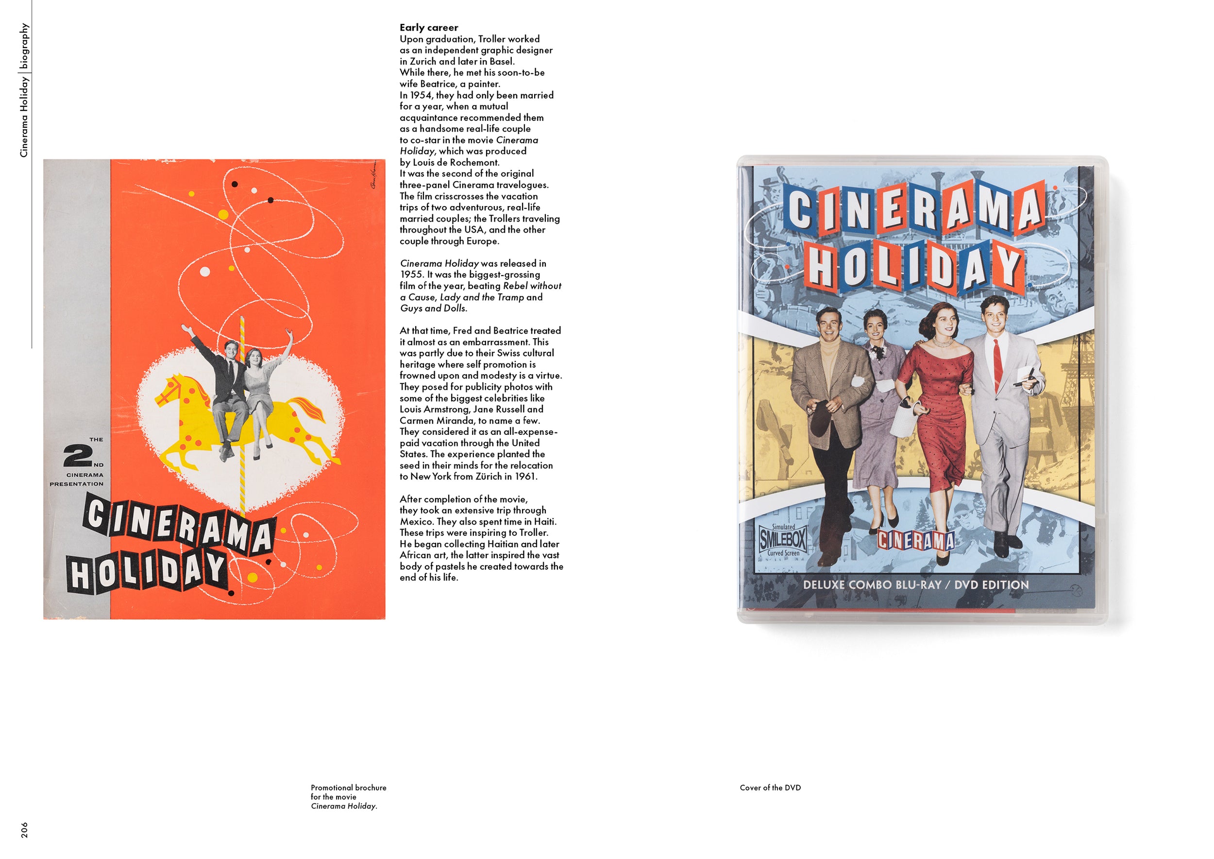
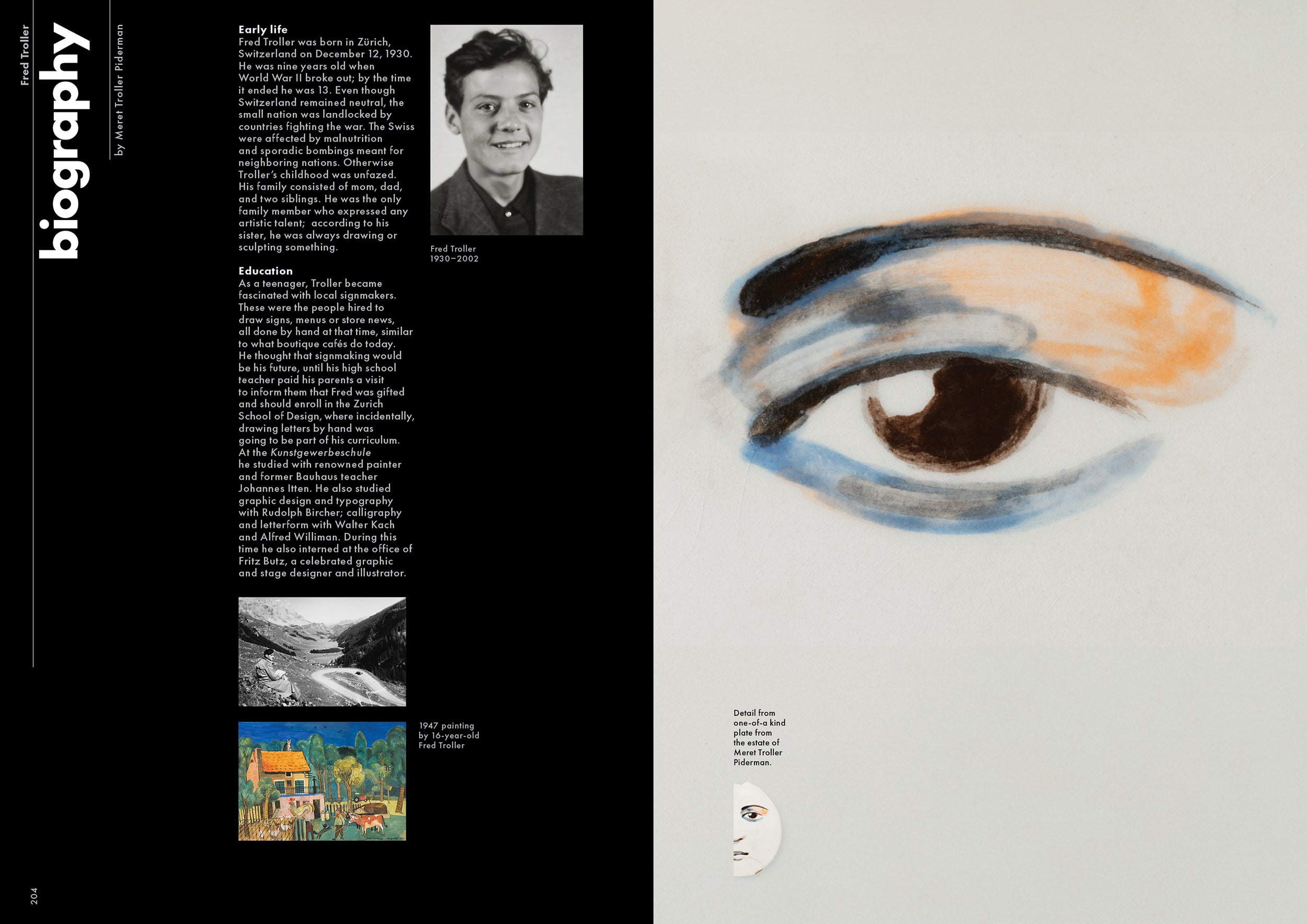
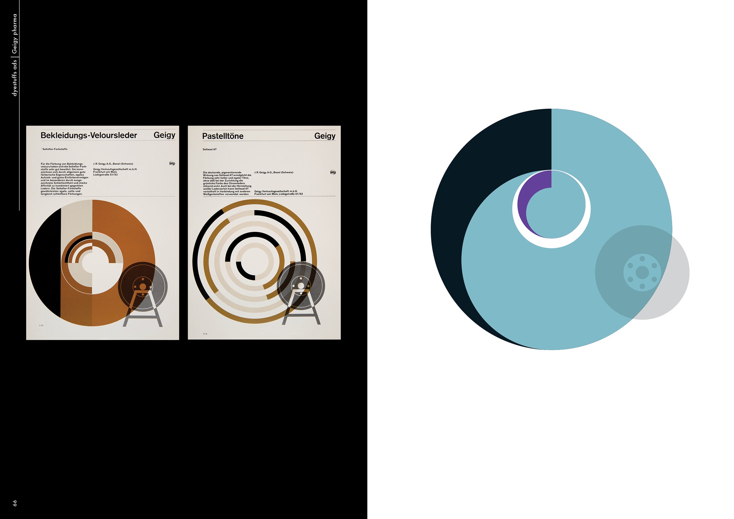
Troller was born in Zurich in 1930 and graduated from the Zurich School of Design in 1951. He then worked as an independent graphic designer before relocating to New York in 1960, where he became design director of the Geigy art department. While there he produced a range of influential work for the firm across advertising, packaging and editorial design, making use of grids, white space and abstract graphics, and establishing the clear and direct Geigy style in the process. Troller wrote that “Geigy’s advertising is in reality neither Swiss nor a style. It is the evolutionary result of years of experimentation and discovery.... It is more properly defined as a functional approach to design.”

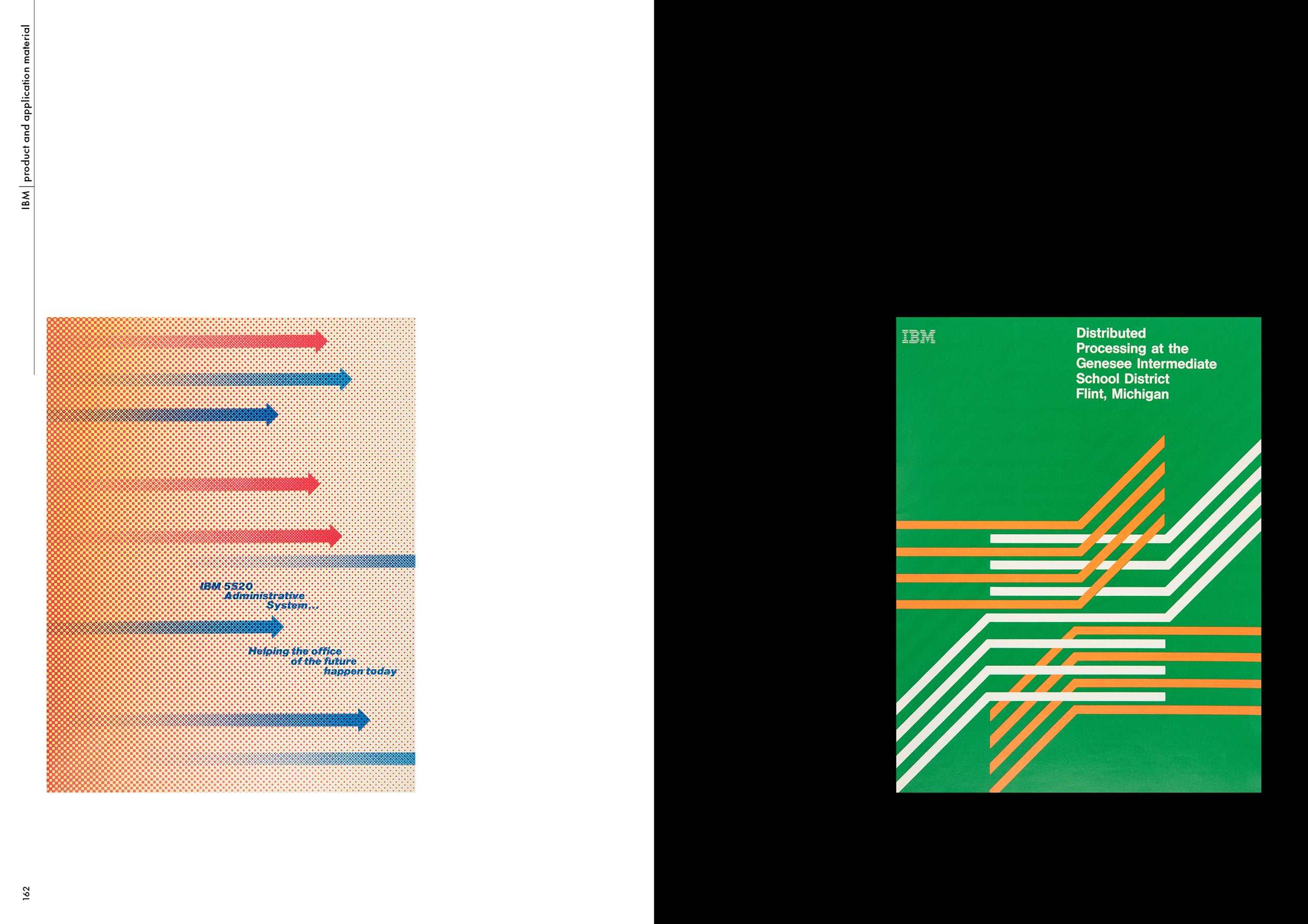
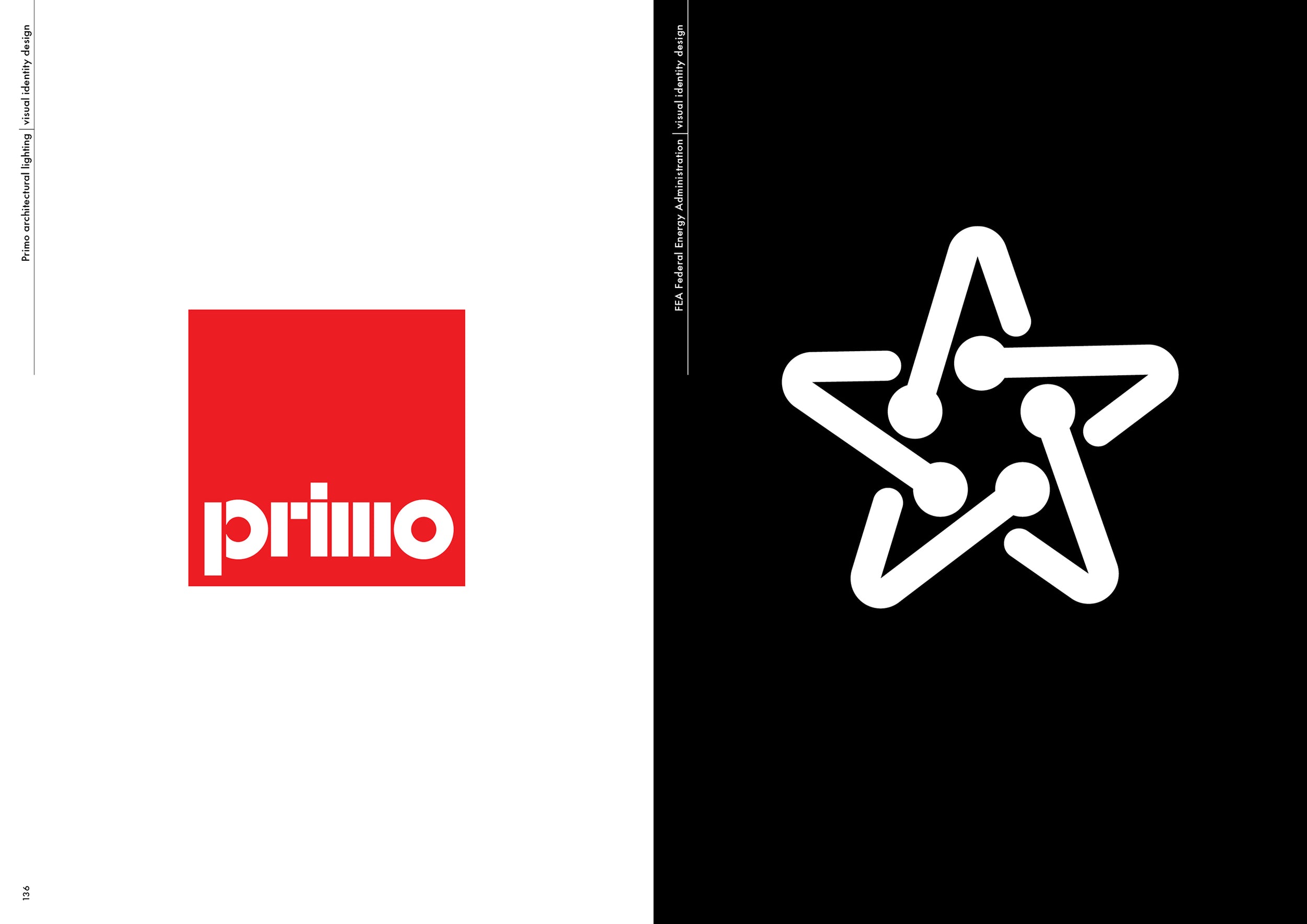
In 1966 he founded Troller Associates, in response to the burgeoning demand for unified graphic identity systems, trademarks and annual reports and worked with clients such as IBM, Cross Siclare Papers, Faber Castell, Hoffmann LaRoche, Champion International, New York Zoological Society and more. In his New York Times obituary of Troller in 2002, Steven Heller wrote that his clear and direct style contained a personal approach “characterised by the manipulation of geometric forms, jarring juxtapositions of large and small type and visual puns formed from the characters themselves.” As a successful artist and sculptor, Troller also exhibited his work in galleries in New York, while in 1995, his design career was celebrated in a retrospective show at Georgia State University. Troller taught at the School of Visual Arts and Cooper Union, among many other institutions, and was chairman of the Division of Graphic Design at Alfred University from 1988 until 2000. He died in 2002 aged 71.

Specification

297 × 210mm
256 pages
Hardcover

Printed 5/5 throughout on 157gsm Matt Art FSC paper.

Swiss-bound hardback with head and tail bands. One colour foil-blocking on case.

Collector’s edition slipcase has a hinged flap on open side with magnetic fastening and is covered in black imitation cloth over 2.5mm grey board, foil-blocked in three colours.
Update #6

Shipping soon, confirm your details

22 comments Nov 18, 2024

Dear supporter,

We are excited to announce that we're expecting copies of Fred Troller Design to arrive at our warehouse next week, and will begin shipping orders the third week of December 2024.

Read update
Update #5

Copies printed and bound

7 comments Oct 22, 2024
Dear backers,
We're delighted to let you know that following several months of colour repro work – and several more weeks at the printer – copies of Fred Troller Design are now printed, bound and on a ship en route to our warehouse. 
Read update
Update #4

The colour proofs are in!

5 comments Aug 16, 2024
Dear backers,

We have good news! Fred Troller Design is now heading to the printers, having successfully gone through the proofing stage. We are currently discussing the final design elements, such as endpapers and head and tail bands, with Dani Piderman, the book’s designer.
Read update
Update #3

A message from Meret Troller Piderman

3 comments Apr 04, 2024
A huge heartfelt thanks to our friends and backers of the Fred Troller Design book, and also to the teams at Volume and Unit Editions.
Read update
Update #2

Funding target update

3 comments Mar 25, 2024
Dear supporter,

Many thanks for backing our Fred Troller Design book. The response has been wonderful and we are determined to see this important title in print.
Read update
Update #1

More Special Editions now available

5 comments Mar 08, 2024
Dear supporter,

Thank you for backing Fred Troller Design and for being a vital part of our campaign to publish this long overdue book. Your support is hugely appreciated and we're delighted that we are well on the way to honouring the work of a true graphic design legend in this unique publication.
Read update
Estimated delivery
Winter 2024
Last update:
Nov 18, 2024

Shipping address changes allowed until

How it works

If our funding goal is met before GMT this project will commence development. All pledges will be immediately refunded in full if the funding goal is not met.

Estimated delivery

Winter 2024

Shipping

Tracked worldwide

His designs successfully combined Swiss rigorousness with American vitality

Massimo Vignelli

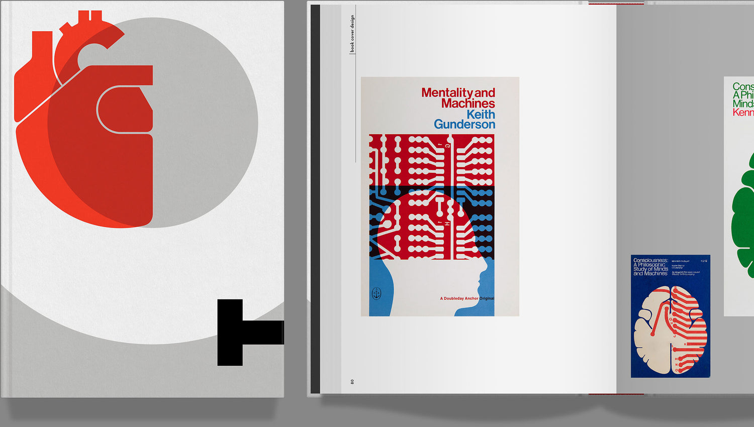
Fred Troller Design features a wide range of client projects and includes over 60 pages dedicated to his work for Geigy, 50+ pages of book covers, as well as numerous examples of his visual identity and poster design. The book, designed by Dani Piderman, also includes essays by Steven Heller and Mark Owens, alongside a personal biography written by Troller’s daughter, Meret Troller Piderman.

Publisher

Unit Editions

Profile

Unit Editions is an independent publishing venture, producing books for an international audience of designers, design students and followers of visual culture. The company is hugely experienced in the production and delivery of books and publications, using only high quality suppliers (printers, binders, etc.) and distributes titles globally on a daily basis.

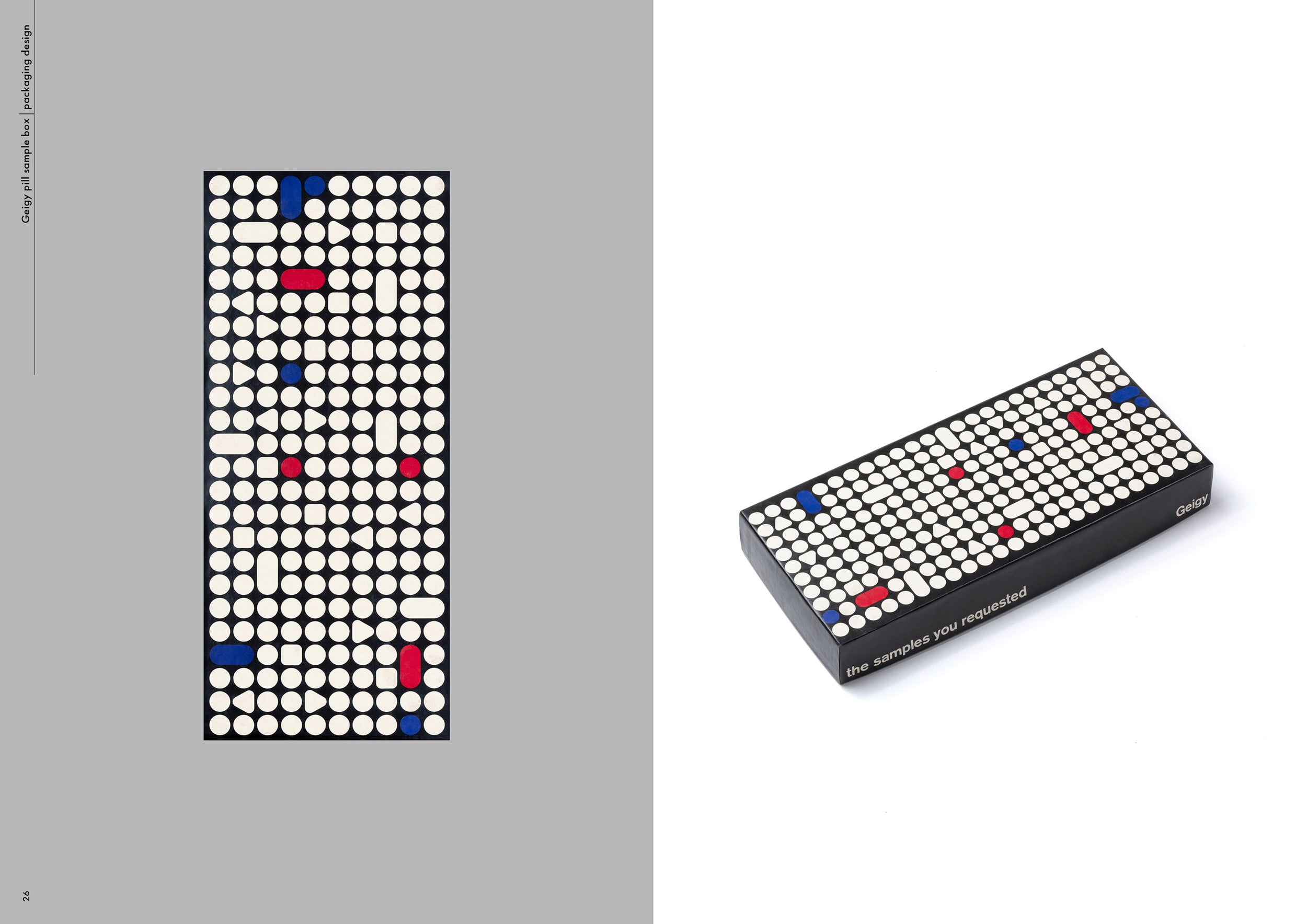
The collector’s edition of Fred Troller Design features a bespoke slipcase, foil-blocked in three colours and hinged with a magnet fastening. The slipcase design references a pill samples box that Troller originally designed while at Geigy.

The object was to communicate logically, vividly and without ambiguity

Steven Heller

I feel that the character and philosophy of the company should be visible in everything

Fred Troller
Meet the author: Dani Piderman

Born and raised in Zurich, Switzerland, Dani Piderman found his way into the world of visual communication through photography. He had the fortune that Swiss influential designer Fred Troller offered him the opportunity to learn the fundamentals of graphic design and typography at his studio in New York. Later milestones in his design work included eight years of working with another design visionary, Massimo Vignelli; directing graphic design at JCDecaux USA in New York; and leading design projects at Benetton’s Fabrica in the Veneto region of Italy. His diverse graphic design experience ranges from corporate to non-profit museum work, from visual identity systems to books. He is currently a consultant for graphic design and photography. 

Meet the author: Meret Troller Piderman

Meret Troller Piderman’s unique position as the only daughter of the prominent Swiss graphic designer Fred Troller allowed her an intimate view into her father’s work, shaping her own artistic pursuits. Growing up with her father working from their family home, she was organically immersed in his design process, contributing to her keen interest in the arts. Her contribution to the book is deeply personal and biographical. Her perspective highlights Fred Troller not only as designer but, more profoundly as father. This nuanced portrayal provides a unique insight into the man behind the designer. Beyond her personal endeavors, Meret’s role as an art educator to children for over 20 years showcases her commitment to sharing her passion and skills in various artistic domains as well.

Also available on Volume View all
The Super Shinobi II cover illustration (Japan), 1993

Sega Mega Drive/Genesis
Ultimate Works

2 exclusive editions

Type Archived: A visual journey through typographic history

28% funded 28 days left