Letters from M/M (Paris)

A deluxe three-volume collector’s edition on the wildly imaginative typography of legendary design studio M/M (Paris), written and designed by letterform historian Paul McNeil

  • 60 of 500
    copies remaining in edition
  • $115.00

Overview

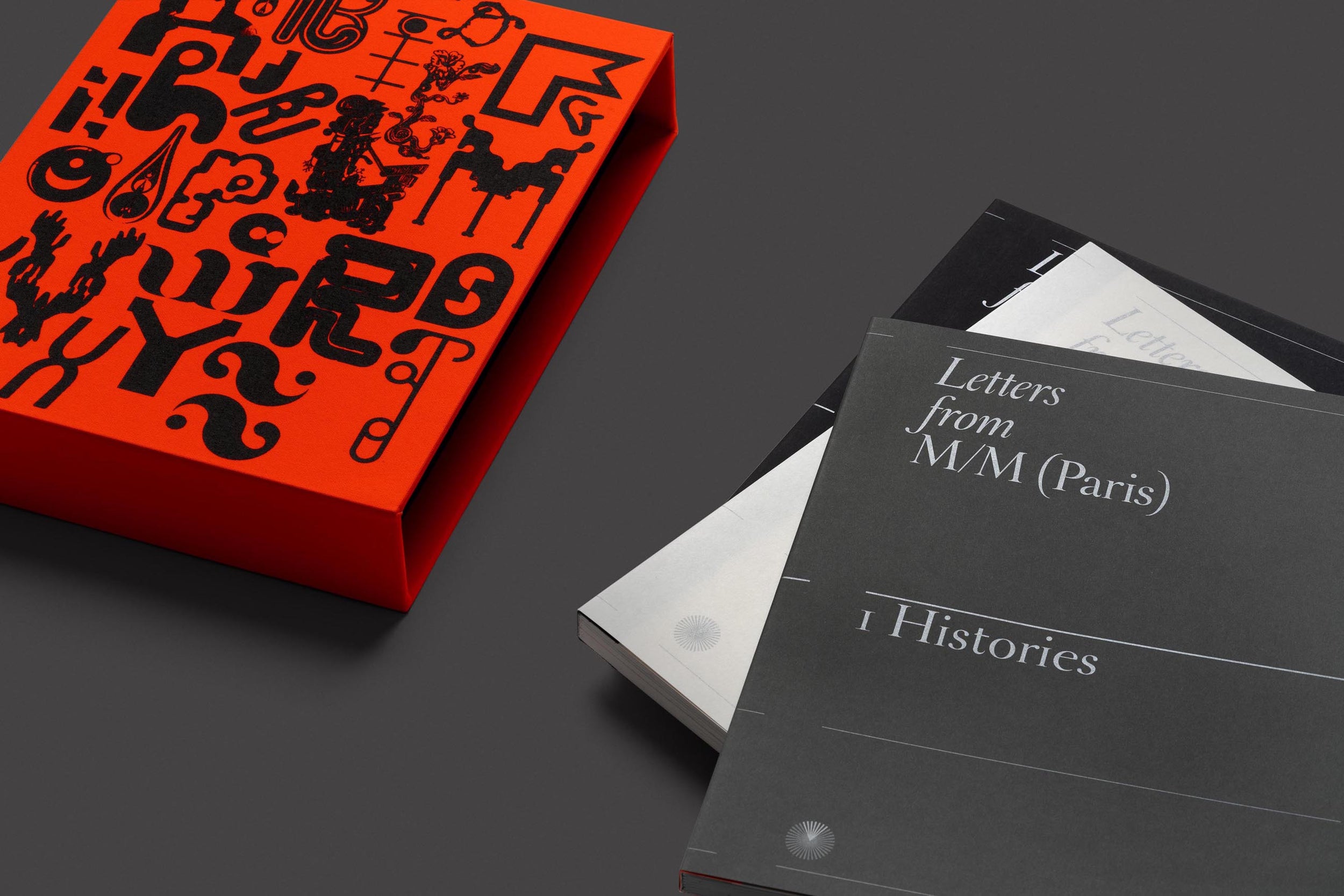
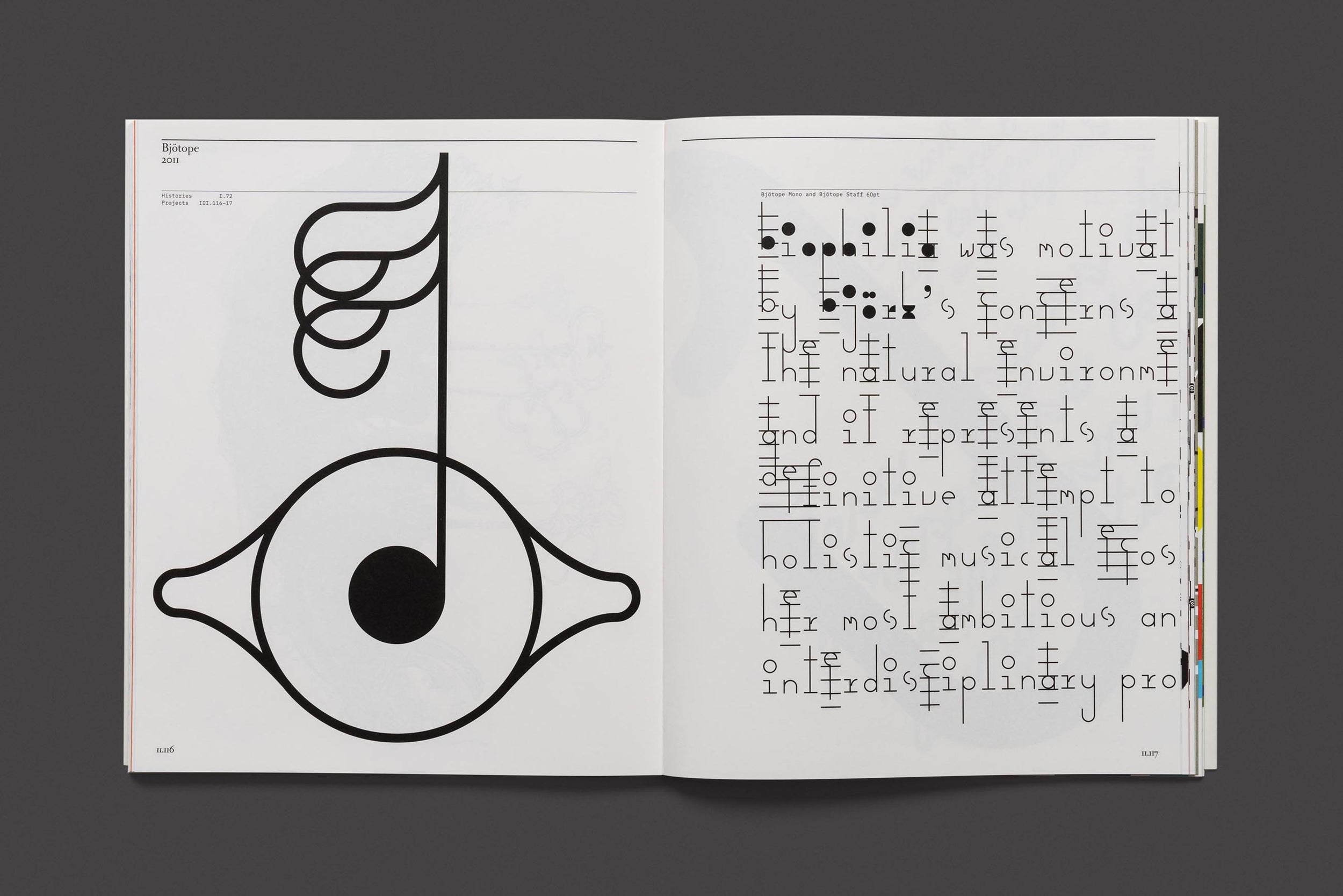
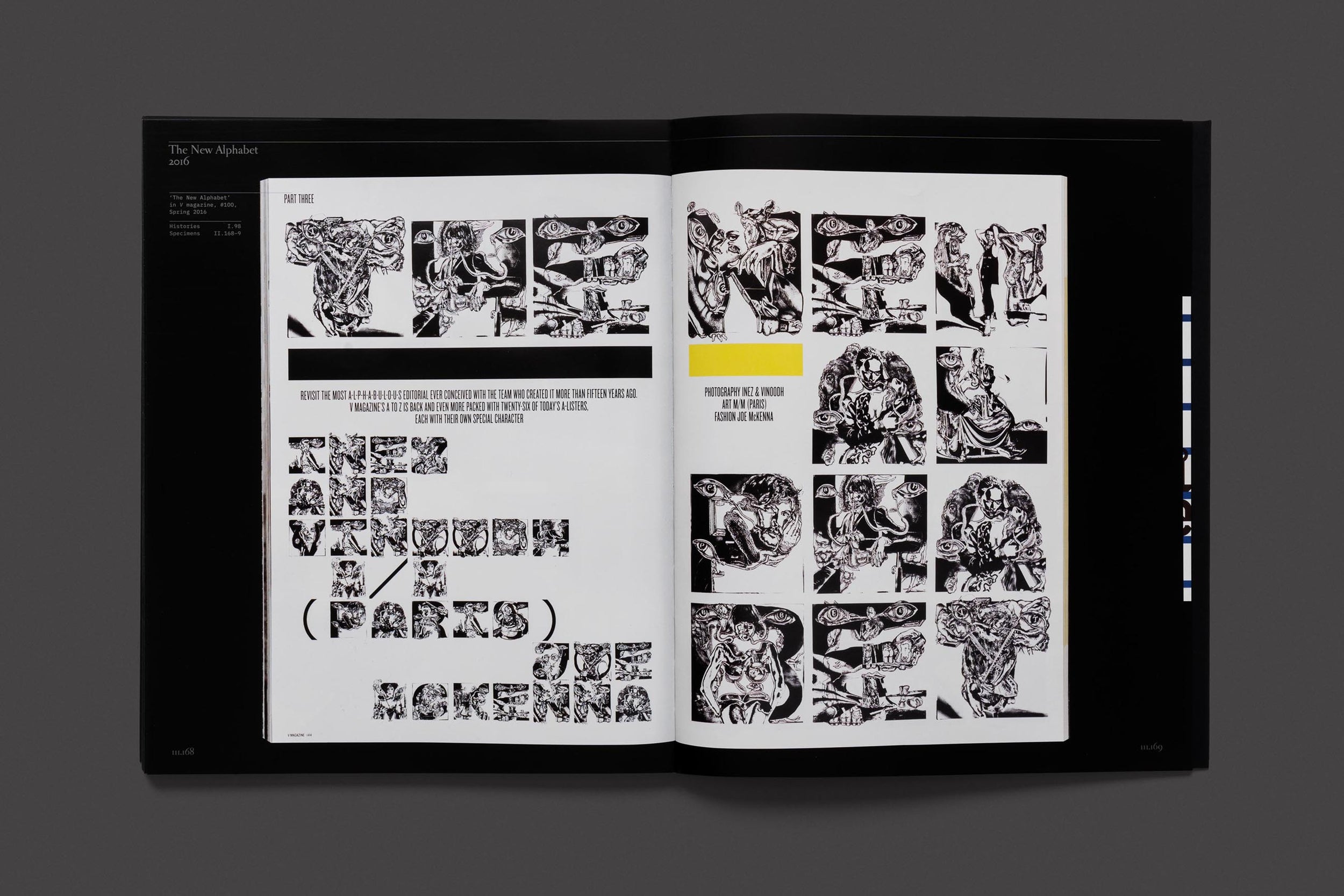
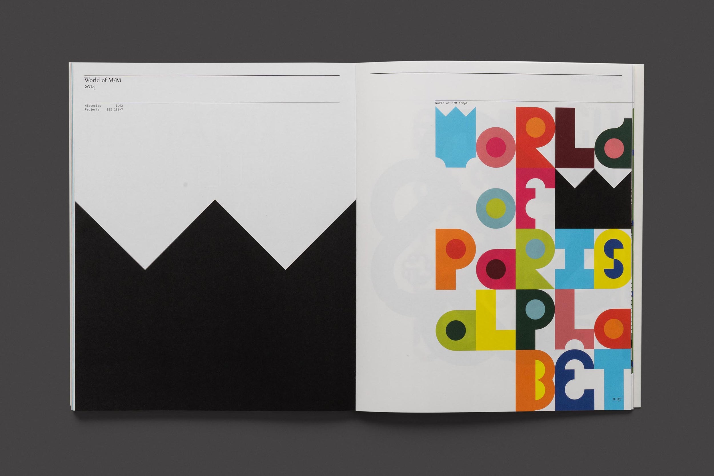
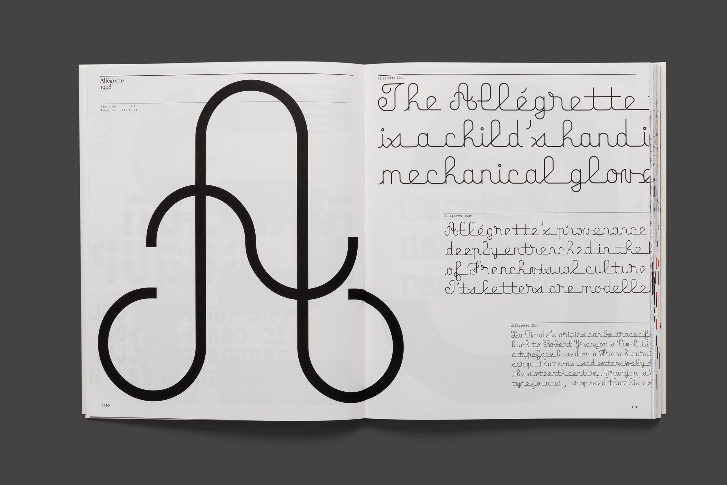
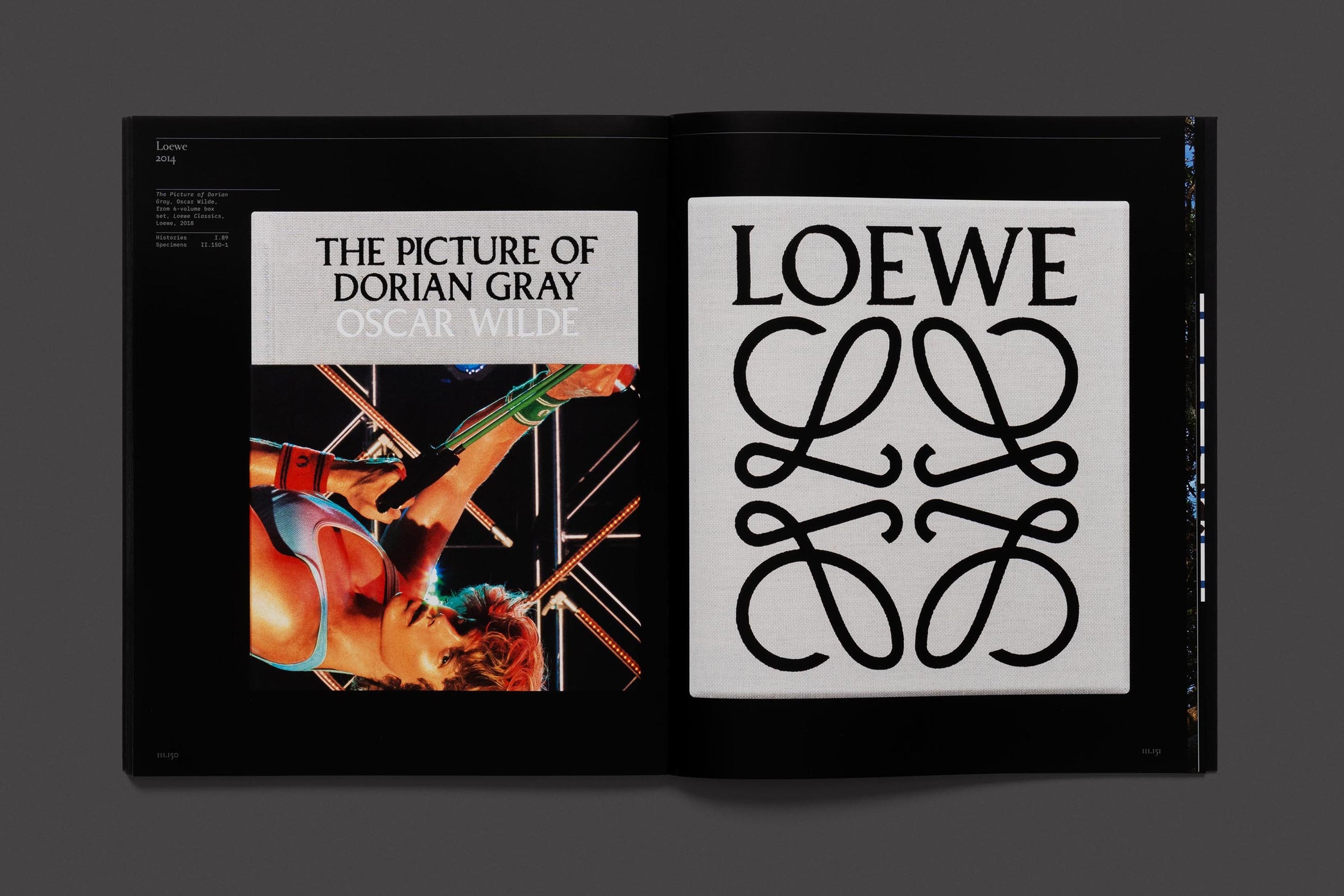
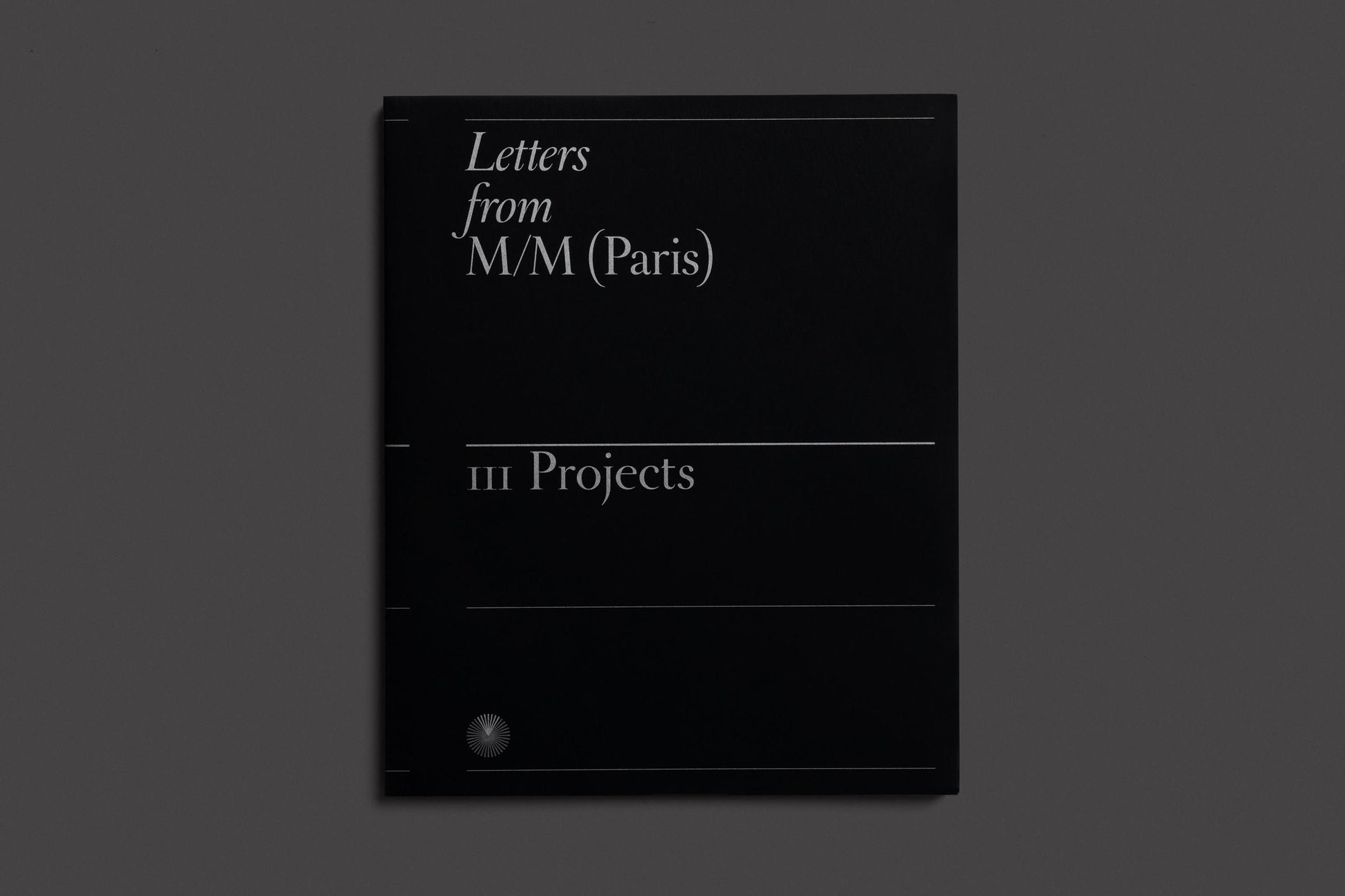
Letters from M/M (Paris) is a comprehensive study of the typefaces produced by Michaël Amzalag and Mathias Augustyniak since they founded their influential art and design practice, M/M (Paris). For the first time, ninety of the designers’ typefaces are catalogued chronologically in three carefully conceived volumes, comprising the history of their development; exclusive type specimens; and detailed illustrations of projects in which they appear.

Written and designed by typography expert Paul McNeil and with a foreword by Björk – whose collaboration with M/M spans over two decades – this encyclopaedic publication traces the distinctive and integral nature of type, lettering and signs in the work of M/M, from one-off artistic commissions to fashion branding and their long-lasting partnerships with musicians and theatres.

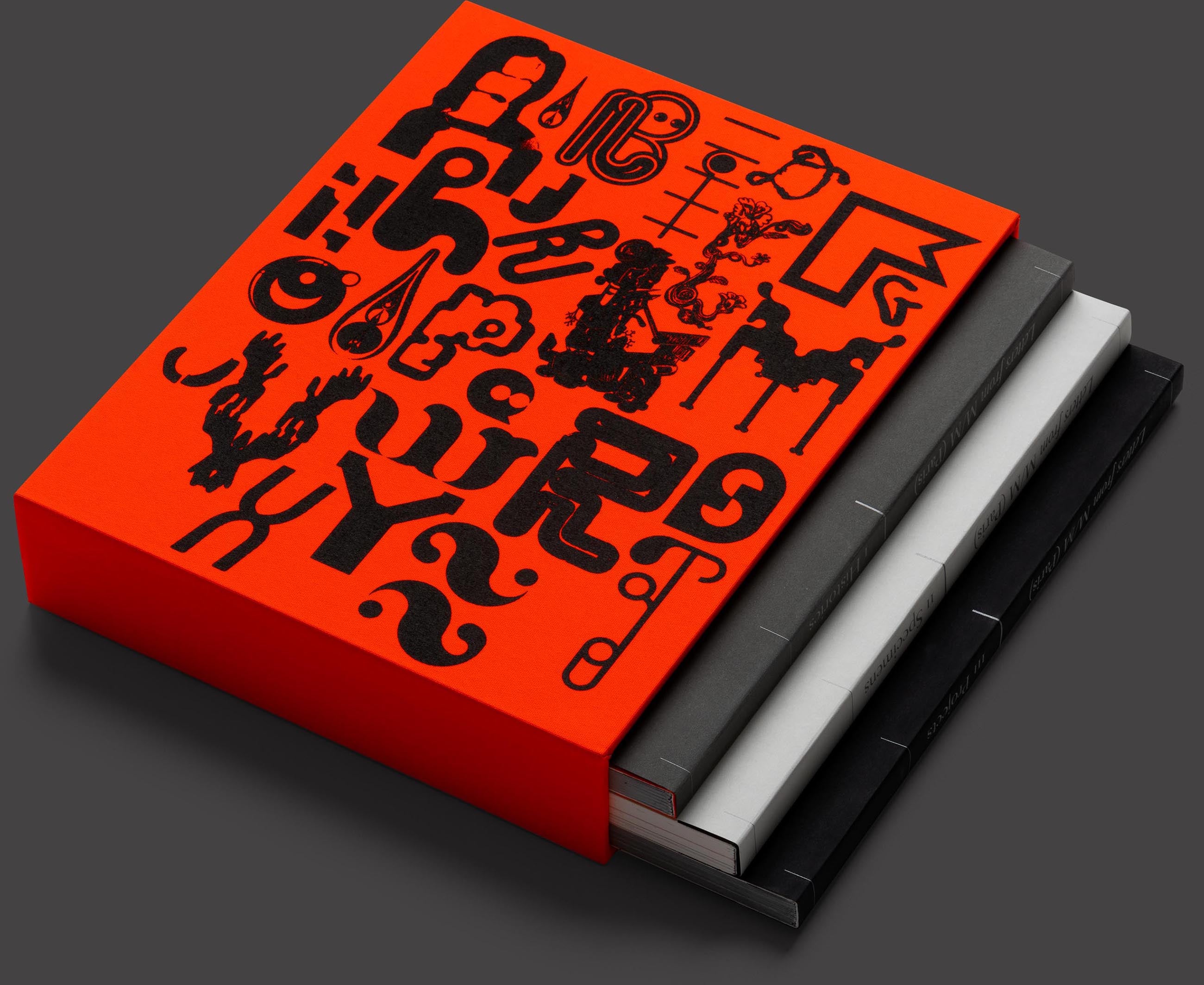
This deluxe collector’s edition, specially conceived by M/M, is available exclusively on Volume. With a nod to type specimen books, each book is a jacketed paperback, set together in a slipcase for protection and aesthetic pleasure. Numbered and signed by the designers, it is the perfect companion to the two-volume monograph M to M of M/M (Paris).

Author and Designer

Paul McNeil

Genre

Graphic Design
Typography

Specification

Three jacketed paperback volumes set within a cloth-covered slipcase
258 x 210 mm
480 pages
Printed in six colours
Three paper stocks
Signed by the designers
Edition of 500

The three books, each featuring jackets with metallic-ink details, are housed in a clothbound ‘blaze-orange’ foil-blocked slipcase.

Exceeding the conventional limits of graphic design, M/M’s studio practice might be described as a semiotic laboratory. With roots buried somewhere between post-structuralism and post-punk, M/M’s work plays mischievously with the conventional language of graphic communication.

Paul McNeil

M/M are kinda like font-psychics
they tune into each project and become that
they are the method actors of letters
and transform seamlessly from one award-worthy role to another
reading clairvoyantly what shape of A, B and C´s are needed in each play

Björk

We aim to create a landscape in which there can be a dialogue between us and the viewer. We develop a language to give the idea that the landscape you enter is a forest of signs.

Michaël Amzalag and Mathias Augustyniak

Meet the author

Paul McNeil is a graphic designer, writer and educator, and was formerly Course Director of MA Contemporary Typographic Media at the London College of Communication. In 2009 he co-founded MuirMcNeil with Hamish Muir, a design practice whose activities are focused on exploring systematic methods in design for visual communication. Seven years in the making, The Visual History of Type, McNeil’s definitive survey of type and typography from 1450-2015, was published in 2017.